


On the subject of “advertising manga,” this article explores how manga, a complex combination of panels, bubbles and other elements, have been adapted for advertisement. Part 1 has analyzed the examples of ads in magazines, posters, direct mail and other media and found that the ads make the most of the excellence of manga in giving explanations with words and pictures. Part 2 will explore production of advertising manga designed more to “be seen.”
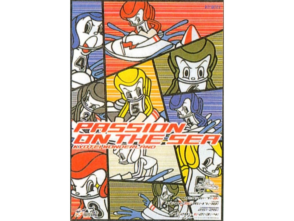 “Fukuoka motorboat racing” poster (I: KUBO Seijiro, CD+AD: HARUTAKA Hisato)
The issue 112 of “Illustration,” Genkosha, 1998, p. 102
Examples of advertising manga to “be seen”
Part 1 categorized advertisements retaining the characteristics of manga as advertising manga and explored individual cases of ads in magazines, posters, direct mail (DM) and other media. As a result, it is found that manga tends to be chosen because of its excellence in explanation. While examining restrictions on the range of expression of such advertising manga designed to “be read,” Part 2 will explore production of advertising manga designed to “be seen.”
As soon as advertising manga has a particular purpose, for instance, to promote a product; its range of expression seems to be limited. As is the case with Japan Airlines’ “Wa-ikiiki” plan cited in Part 1, when an artist creates manga for an ad, the client may specify a plot or lines. That is a restriction. In addition, because explanation is important, change of viewpoint easy to understand or tranquil panel layout rather than visually dramatic elements will be required.
Such readability is not the only characteristic of manga but manga is also visually entertaining with various effects, including dynamic panel layout and saturated linework. In that sense, advertising manga created by local governments, religious groups or businesses and distributed by DM like the ads for Shinken Seminar (they can no longer be clearly differentiated from ordinary manga in some cases) can be said to have a purpose of appealing to the eye, for instance, by using large panels. Still, this category of ad manga remains story-centered and designed to “be read.” If there are advertising manga less restricted by the stories and designed to “be seen,” what will they be like?
The first example is the “Fukuoka motorboat racing” poster created in 1998. The illustrator is KUBO Seijiro, who is also an established character designer. The poster shows manga characters of boat racers with speed lines in their background to express the speed and they are split into panels. Although no speech bubbles or words are used, it will be a good example of an ad completed with manga’s distinctive way of expression.
The next example is the poster for “SKY Perfect Communications” for which SATO Kashiwa served as the art director in 2003. The logo functions as the character and bubbles and words are used to make a rhythm. The ad has no contour lines of panels but it looks to be divided into panels by the space between dotted backgrounds (they are associated with screen tones used for manga), their misalignment and the use of different colors. Using the logo as a character is interesting. The logo appears several times in different arrangements and it shows various facial expressions as if it is a protagonist of manga.
 “SKY Perfect Communications” poster (AD: SATO Kashiwa, CD: TADA Taku)
ADC Almanac 2003, Bijutsu Shuppan-sha, 2003
This potential of advertising manga has been explored lately and some ads have succeeded in combining the features of being read and seen. Among them, one case I would like to mention first is the works of MOROOKA Toru. For six years from 2013 to 2018, he created advertising manga for the posters of “anti-groping campaign” mounted jointly by JR, private railway companies and the police in the Kanto area. He used panel layout and saturated linework effectively and created works with an outstanding structure faithfully following the format of manga.
What’s noteworthy about MOROOKA is that he takes apart manga into symbols and reconstructs them. He used a different style of picture every year to reflect the trend of each era from the 1960s to the 1990s. Covering various genres, such as gekiga (graphic novel), romantic comedy and girls’ manga, he desires to “imitate the era (*1)” not a particular manga artist. In addition to the style of picture, it seems, he chooses typography similar to the so-called “Anti-Gothi” combination – Antique fonts for kana syllabaries and Gothic fonts for kanji – widely used for manga since the 1970s, for speech bubbles.
That indicates his intention to offer the audience an experience as close to that of reading manga as possible.
Particularly, the masterly panel layout of the poster of 2017 is worth mentioning. The poster of that year is designed to lead the audience’s eyes in the direction of reading vertically written text by emphasizing vertical movement in the second to fourth panels while manga is usually read horizontally. It is an example of a successful transfer of the dynamic movement of manga, in which a page is freely divided to convey a message, to an advertisement.
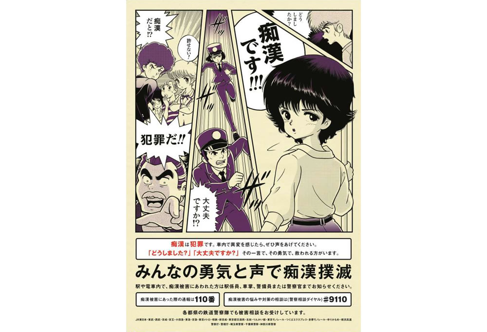 “Anti-groping campaign” poster
Website of the Bureau of Transportation, Tokyo Metropolitan Government
https://www.kotsu.metro.tokyo.jp/pickup_information/news/subway/2017/sub_p_201705307426_h.html
Attempts to combine the features of being read and seen are observed in various other advertisements besides those created by MOROOKA. All the cases below can be said to have such intentions. For example, let’s look at the teaser flyer of “Pan-tastic!! 2016 Autumn” directed by KAYA Hiroya (Conico). TAKAHASHI Yuki created manga for the ad. It consists of two panels. Although the layout is simple, the saturated lines in the first panel and the handwritten letters and the character sticking out the panel add vigor and make the line said by the character in the second panel convincing. Techniques of manga, although only minimum, are used effectively.
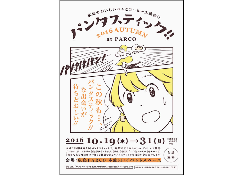 “Pan-tastic!! 2016 Autumn” teaser flyer
TAKAHASHI Yuki website https://takahashiyuki.com/work161001/
Another unique example is a poster created as part of the campaign for PRIVIO printer by Brother Industries in 2013. The ad uses Ashita no Joe (Tomorrow’s Joe). A copy “Kore ga ashita no jo-shiki (This is tomorrow’s norm)” is shown in a relatively large font to keep the minimum function of an advertisement but it appears to have something in common with a certain type of girls’ manga in terms of format because of the free structure without clear continuation of panels.
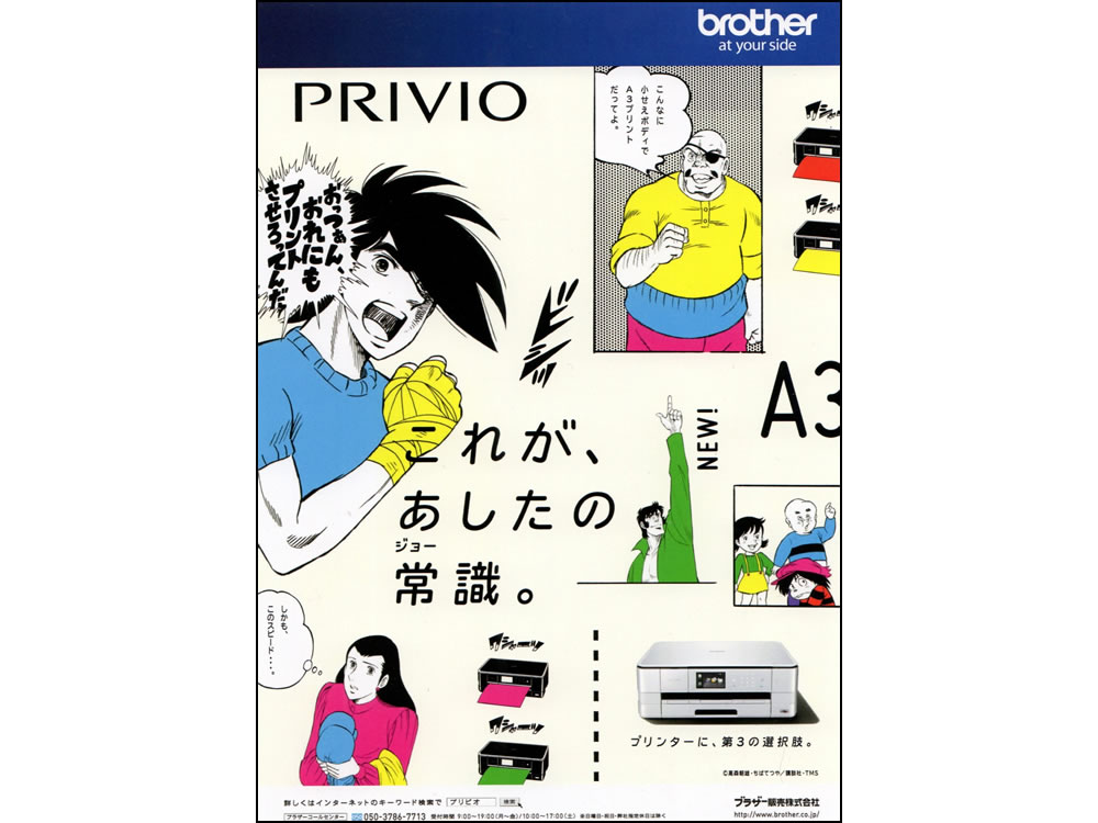 “Brother PRIVIO” poster (CD: OZAKI Yoshihisa, AD: KATO Hiroyuki)
Comic mix design: Feature on advertisements and campaigns using anime, manga, video games and characters, PIE International, 2015, p. 84
As HOSOMA Hiromichi pointed out about manga by OSHIMA Yumiko saying “It is not so obvious as ordinary manga in what order lines are said or who are saying the lines (*2)”, manga does not always have a linear continuation but it can be based on another system. Many girls’ manga artists have pursued the possibilities. From the placement of colors, I surmise that the layout was chosen according to the principle of design composition rather than manga. However, the poster turned out to have what was close to the proselike feature of manga and it was designed to convey the appeal of the product flexibly and multilaterally by the feature.
HANAKUMA Yusaku and IKEDA Riyoko collaborated in the production of the poster and magazine ad for “Osoji yokuso,” an automatic self-cleaning bathtub, launched in 2013 by the household equipment manufacturer Noritz Corporation. Despite the difference between their drawing styles, they harmonize with each other as controlled by the panels. That is an expression only manga can achieve.
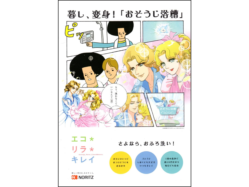 “Noritz Osoji yokuso” poster/magazine ad (CD+CW: KAWAGUCHI Osamu, AD: NAKAMOTO Gen, I: IKEDA Riyoko and HANAKUMA Yusaku)
“Comic mix design: Feature on advertisements and campaigns using anime, manga, video games and characters,” PIE International, 2015, p. 87
The web ad for Softbank Mobile in 2013 “Howaito jakku ni yoroshiku (Say hello to White Jack)” was impressive advertising manga. It was a parody using modified lines from manga titled Burakku jakku ni yoroshiku (Say hello to Black Jack) (SATO Shuho, published in Morning from 2002 to 2006), of which the author completely permitted secondary use in 2012. The seriousness of the original was turned humorous by replacing the liens in bubbles with advertising copies. I must also add that this case is influenced by an environment manga has been placed in since the spread of social media. On social media, it happens every day that “a somehow impressive scene of manga goes viral without the source being identified (*3).” It was possible to create advertising manga like “Howaito jakku ni yoroshiku” probably because it was presented on the Internet where imitation and secondary use were way of life.
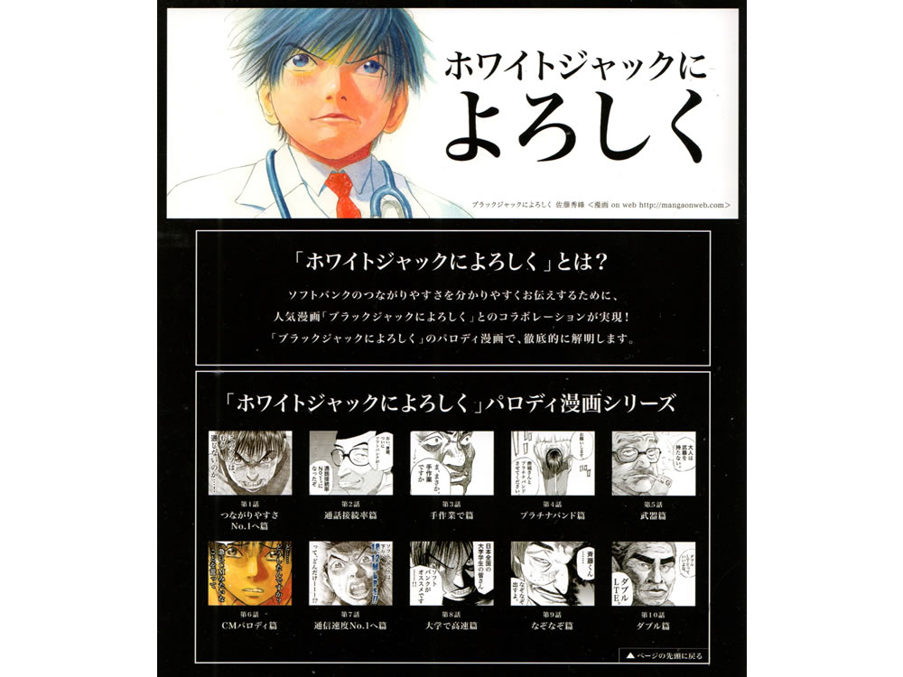 “Softbank Mobile ‘Howaito jakku ni yoroshiku (Say hello to White Jack)’” web page, (CD+CW+AE: TAKEDA Yosuke)
Comic mix design: Feature on advertisements and campaigns using anime, manga, video games and characters, PIE International, 2015, p. 106
Diversification of advertising manga in Japan
The above examples are different from advertising manga designed to “be read” with a focus on the excellence of manga in explanation or those intended to “be seen” as graphic design. They succeed in appealing to the eye by using manga’s techniques that are not expository while they are also designed to be read. In other words, they are both manga and advertisements. All the examples presented possess readability and narrativity good enough as manga. At the same time, they retain the functions as ads, which is indicated by the conversion of a contrast in panel size into graphic strength, a balance in a layout maintained by the use of colors, a contrast between different drawing styles and the use of unique copies. Being an ad is reconcilable with being manga and those advertising manga are aimed at achieving synergy between them.
YOMOTA Inuhiko, in his book Manga genron (Principles of Manga) published in 1994, says “Today, manga literally covers our intellectual canopy, and gives the impression that it is now beyond any standard and that it has become culture, not a counterculture (*4).” This article does not present the examples chronologically, but rather tries to explore individual examples. That is because I have not conducted encompassing studies on advertisements and therefore I cannot determine which advertising manga were innovative in the history of advertisement. In fact, I might have even missed out some important examples of advertising manga. For what I fail to include in this article, we just have to await further study in this field.
If manga became “culture” in the mid-1990s as YOMOTA said, it would be reasonable to assume that influence to be demonstrated in advertising manga created since the late 1990s. Because of the influence, I reckon, advertising manga in Japan were being designed more and more to “be seen” not just to “be read” and as a result they have diversified so broadly that those combining both features have emerged. Those examples are based on the rules on the format of manga, such as the order of reading panels and the use of speech bubbles, not simply using manga characters. We understand them without any difficulty and get the messages they try to convey.
Regarding MOROOKA’s “anti-groping campaign” poster, TSUZUKI Jun Tsuzuki says, “Such visual communication may be valid only in a place like Japan where the subculture including manga and comedy have matured (*5). That also applies to other advertising manga besides MOROOKA’s. “Advertising manga” in Japan may be born when the social acceptance as pointed out by Tsuzuki meets the intention of a business or a creator.
(notes)
*1
TSUZUKI Jun and MOROOKA Toru, “Irasutoreishon okataro (Let’s talk about illustration),” the issue 200 of Illustration, Genkosha, 2013, 98
*2
HOSOMA Hiromichi, “Fukidashi no junjo to kizoku nitsuite (Sequence of speech bubbles and their speakers),” Manga Shikakubunka ron miru, kiku, kataru (Visual culture studies: See, hear and talk) edited by SUZUKI Masao and NAKATA Kentaro, Suiseisha, 2017, 151
*3
MIWA Kentaro, “Danpenka to busshitsusei—Manga to media o megutte (Fragmentation and materiality – about manga and media),” Manga/ Manga/MANGA—Jinbungaku no shiten kara (Manga – in terms of study of humanities), edited by MAEKAWA Osamu and OKUMURA Hiroshi, Kobe University Press, 2020, 231
*4
YOMOTA Inuhiko, Manga genron, Chikumashobo, 1999, 13
*5
TSUZUKI Jun, “MOROOKA Toru san no shigoto ‘Chikan Bokumetsu Poster’ (Work of MOROOKA Toru ‘anti- groping campaign’ poster (SUZUKI Jun),” Tokyo Illustrators Society (TIS), November 25, 2013
https://www.tis-home.com/column/detail.html?id=1461
[references]
Manga, anime raitonoberu no dezain (Design of manga, anime and light novels) edited by the editorial department of IDEA magazine, Seibundo Shinkosha, 2011
Comic mix design: Feature on advertisements and campaigns using anime, manga, video games and characters, PIE International, 2015
*URL links were confirmed on October 22, 2020.