


Pixel art (dotto-e in Japanese) is a form of visual representation. The term “pixel art” may imply retro game graphics as it was the mainstream of video game graphics from the 1970s to the 1990s. On the other hand, in recent years, its characteristics has been widely accepted as a distinctive graphic style that is “old yet new” in a way. In this article series, we introduce the features and attractiveness of pixel art as a form of representation, including these trends. The second part shows a variety of pixel art and considers its diversity in terms of an art-historical notion: style.
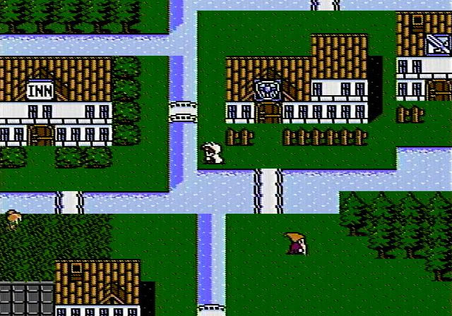
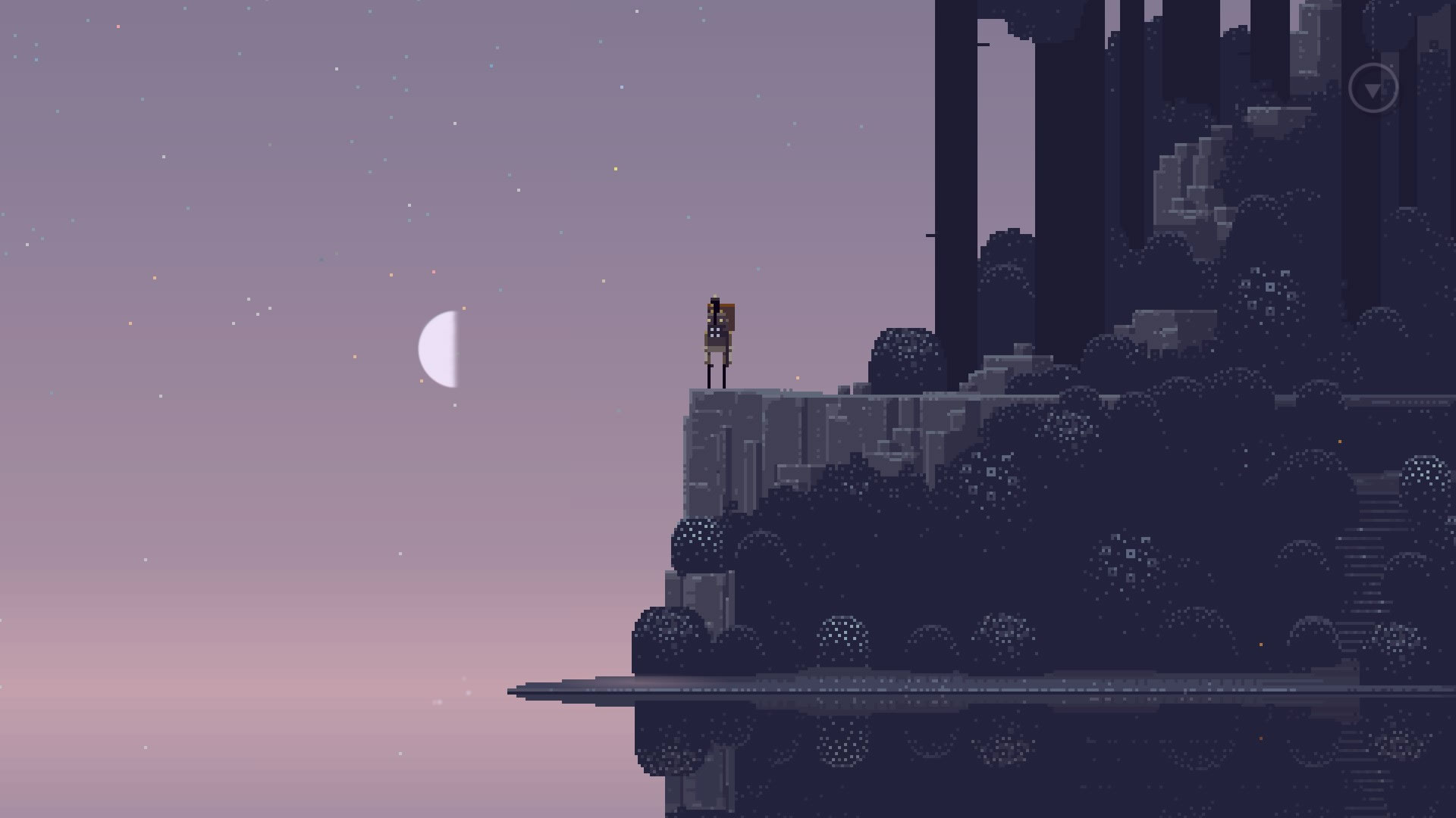 Superbrothers: Sword & Sworcery EP (Superbrothers and Capybara Games, 2011)
Pixel Arts Vary
I proposed a formal definition of pixel art in the previous part. Put briefly, a pixel art is a picture that consists of a set of constituents each of which is distinguishable by a naked eye, square-like shaped, equal to each other in size, and arranged in a square grid, where a slight change in constituents tends to result in a significant change in what is depicted. Still, images that satisfy these conditions are of great variety because pixel art has its sub-categories just as most other art genres.
What species of pixel art exist specifically? IGN Japan’s vice editor-in-chief IMAI Shin tries to classify pixel arts in modern games using a two-dimensional graph with two axes (*1). The horizontal axis indicates the “retro/future” spectrum and the vertical the “high-bit/low-bit” one. The scope of this diagram is limited to modern games, in particular indie ones, but it is useful enough for roughly understanding what kinds of pixel art there are in general and how they differ each other.
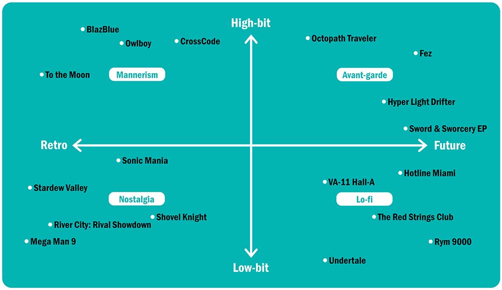 IMAI Shin’s taxonomy of pixel arts in modern games from Pikuseru Hyakkei (Graphicsha, 2019), translated by me
According to IMAI, the “high-bit/low-bit” axis describes how high or low the level of graphical technology used in each pixel art is. For example, pixel arts differ in the density of pixels (resolution), the number of colors available (color depth), the utilization of 3D graphics and additional effects such as lighting, and so on. The “retro/future” axis distinguishes more retrospective styles that appear to seek to bring back “the good old days”, from more futuristic styles that pursue new and revolutionary expressions using the form of pixel art (*2). The intersection of these two axes divides pixel arts into four main directions, each of which may correspond to a kind of visual impression. IMAI names them respectively avant-garde, mannerism, nostalgia, and lo-fi. To figure out the classification, let us see individual examples that embody each extreme.
Species of Pixel Art
 Stardew Valley (ConcernedApe, 2016)
Stardew Valley, located on the extreme left in IMAI’s diagram, has a graphic rendered in an obvious retro style. It inherits with little modification the ways of representing scenes characteristic of Japanese video games in the mid- 1990s, more specifically Japanese role-playing games for the fourth-generation game consoles such as the Super Nintendo Entertainment System. In addition, Stardew Valley’s graphics is not so different from the standard at that time as for technology: middle resolution, relatively rich colors, orthodox 2D graphics, and so on. Thus, this work safely falls into the “nostalgia” category in the above scheme. Since the fourth-generation consoles generally employ 16-bit processors, this kind of graphics is commonly called 16-bit style.
At the opposite pole is Superbrothers: Sword & Sworcery EP, whose graphics may also be built on no higher technology. Granted that its lighting effects are rather sophisticated, it still uses a traditional technique for making pixel arts where the artist puts colors pixel by pixel. The peculiarity of Sword & Sworcery’s graphic is in not its technological but representational dimension, that is, its way to represent persons, objects, scenes, and actions by means of a set of pixels. It also differs radically from the classical and conventional pixel arts like Stardew Valley as to the tone of color and the whole mood it produces. Indeed, it can be said that the art style of Sword & Sworcery is entirely new so that it has come into being exactly when this game was released (*3). That is why it is placed in the futuristic pole of the graph.
 Undertale (Toby Fox, 2015)
If the contrast between Stardew Valley and Sword & Sworcery is primarily on the horizontal line, another contrast needs explanation. The pixel art of Undertale, positioned at the bottom and slightly right, may remind us of older and more low-tech graphics than 16-bit style, one called 8-bit style typical of the third-generation game consoles in the late 1980s including the Nintendo Entertainment System. For it employs just a few colors almost without gradation to depict characters and things, leading to plainness and solid-color. As a result, it might make a much more flat impression than the screen of Stardew Valley. In spite of its conscious lowtech orientation, Undertale’s artwork is somewhat novel and idiosyncratic, by virtue of which IMAI would put it within not the “nostalgia” but the “lo-fi” section.
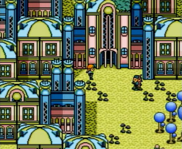
Octopath Traveler (Square Enix and Acquire, 2018)
The visual representation of Octopath Traveler provides a marked contrast to that of Undertale. Though individual characters are represented in the traditional Japanese RPG-like pixel art style, the geography that they walk around is rendered as 3D objects based on polygon models. Furthermore, graphical effects such as lighting and shallow focus are applied in a highly mannered way. No doubt these elegant representations require a certain level of technological basis and was almost impossible to realize during the period in which 2D graphics was substantively the only option. Thus, putting aside where it should be plotted on the horizontal axis (*4), Octopath Traveler will certainly be fit for the highest position of the chart.
In this way, pixel arts come in many varieties. Of Course, they are not scattered randomly but organized in different groups or clusters. “8-bit style” and “16-bit style” are examples of the well-established terms for such bunches. In addition, we could find clusters yet unnamed, such as ones that IMAI attempts to refer to and reveal through his own classification and terminology. In the rest of this essay, I propose to treat various clusters of pixel arts, many of which have gone unnoticed, as styles from an art-historical perspective.
What Is Style?
Style is a classificatory notion that has been used in studies on the arts, in particular the field of art history. Art historians have employed the notion of style to characterize and distinguish works of art in terms of times, locations, nations, schools, studios, and/or individual artists. Paradigm cases of style in visual arts include Romanesque, Gothic, Renaissance, Mannerism, Baroque, Classicism, Romanticism, Naturalism, Impressionism, and so on. The likes of them are also found in other arts such as music and theatre as well as more recent popular cultures such as fashion, film, and comics. Indeed, normcore in fashion, vaporwave in music (with its visual accessories), and flat design in graphical user interface all may count as styles in this sense.
Thus style is a way to sort works of art and cultural things, but it is not identical with classification in general. Though it is hard to precisely define the notion of style, it may be allowed to characterize it roughly as having the following features (*5):
1. A style is a pattern that we (or specialists) can recognize as shared by some works or things. Some of such patterns can be explicitly described by words, others can only be felt as a holistic and unclear impression.
2. A style as a pattern is recognizable directly. In other words, any style that a cultural thing has is a perceptible property of it. Not-perceptible properties of it, for example, those that we can grasp only by investigating its history (e.g. who created it, when and where it was released, how it was received by audience, etc.), are not its style (*6).
3. A style is usually connected to a certain entity. For example, Romanesque or Gothic in architecture is connected to a certain period and area. The Impressionist style in painting or the Kei school style in Buddhist sculpture is connected to a certain school, studio, group, or art movement. Some styles are connected to individual artists, as in “Monet’s style”. Some are connected to technology, as we shall see below.
By applying this conception of style to pixel arts, we will be capable of discerning and describing the diversity of pixel arts more accurately than merely saying “8-bit style” or “16-bit style”. We will also thereby gain a way to observe and understand significant developments in the history of pixel arts. After all, stylistics is first and foremost a method to describe history.
Styles in Pixel Art History
It is beyond question that both 8-bit style and 16-bit style are proper styles. They are holistic impressions or patterns that we can perceive in pixel art images. Moreover, they are closely related to certain technological bases, as their names suggest. 8-bit style is a visual pattern similar to one that was typically recognizable in graphics of video games running on the 8-bit consoles, which were dominant in the late 1980s. And the pattern brought out from the 8-bit machines was dependent to a great extent on graphical capabilities of their hardware.
However, even if technology often leads a style, it does not determine it overall. For example, modern 16-bit style pixel arts, such as the artwork of Stardew Valley, are like genuine 16-bit pixel arts, but they are not really restricted by the technological limitation of the 16-bit game consoles, since they run on modern computers. The artists choose styles under the current technological environment, which does not constrain them but gives them a much wider range of graphical options than in the 1990s. To examine the diversity of pixel arts in terms of style is significant just because it allows us to understand artists’ choices, inventions, even habits, aside from technological conditions.
Retrospective or nostalgic representations like Stardew Valley are cases where modern and ancient pixel arts are alike in style despite their technological difference. On the contrary, there are pixel arts that are equal in technology but not in style. Take as examples some of Japanese video games in the 1990s, specifically the then typical role-playing games.
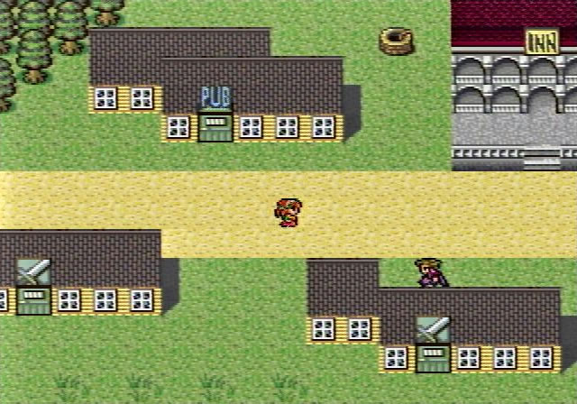 Romancing SaGa (Square, 1992)
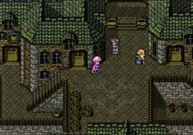 Romancing SaGa 3 (Square, 1995)
These figures respectively show the screen of Romancing SaGa released in 1992 and one of Romancing SaGa 3 released in 1995. Both run on the Super Nintendo as a 16-bit game console and therefore are under the same technological condition. Their impressions are different a fair bit, however. What brings out this difference may be body proportion of figures, size of figures vis-a-vis buildings, delicacy in representing textures of things, usage of tile sets, sharpness of outlines of objects, and so on. A similar contrast could be seen in many other pairs of 16-bit games at that time: for example, between Final Fantasy IV (1991) and Final Fantasy VI (1994) (*7).
 Final Fantasy III (Square, 1990)
In addition, note that these two styles, each of which is a proper style distinct from 16-bit style as a broad category but likely has no proper name, are also found both before and after the period. For example, the art of Romancing SaGa is, at least as to style, closer to one of Final Fantasy III published in 1990 for the Nintendo Entertainment System as an 8-bit console, than one of Romancing SaGa 3. Of course, there is an obvious difference between the screen of Romancing SaGa and one of Final Fantasy III in the number of colors available. Still, they have a lot of visual features in common: body proportion, building size, tile usage, etc. As a result, they may look alike as a whole impression. Thus, it is safe to say that the perceptible pattern they share is a style crossing over the periodization of technology, from the 8-bit era to the 16-bit era (*8).
These cases might suggest that a style always works with a time period: the age gap between Romancing SaGa and Romancing SaGa 3 is about four years, while one between Final Fantasy and Romancing SaGa is less than two years; accoringly, one might think, the latter pair is more alike than the former pair. However, it is not always the case that a difference in style reflects a difference in time. There may be countless examples that show this. For instance, if you compare a title from the Dragon Quest series with one of the same period from the Final Fantasy series, you can easily recognize many differences in their art styles.
 Lennus: Memories of an Ancient Machine (Copya System, 1992)
Lennus: Memories of an Ancient Machine, renamed as Paladin’s Quest in North America, is a striking example. This is a standard Dragon Quest-like Japanese role-playing game released for the Super Nintendo in 1992, but its pixel art is so peculiar that it could be said that it has its own, idiosyncratic style. Specifically, its idiosyncrasy consists of shallowness of buildings, decorative design of things whose parts are simple shapes such as circles and lines, exaggerated outlines of objects, distinct coloring based on pastel shades, and so on.
Regardless of how we should assess this artwork (perhaps it could be evaluated as a “not skillful” pixel art), it is certain that it represents things in a unique, isolated way. We cannot explain why and how this peculiar style came into being only in terms of technological constraints. Instead, we could assume a number of causes: for example, the artist’s skill, habits, or some kind of artistic intention (*9). In any case, it is the job of the stylistics, the study of style, of pixel arts to answer these questions. The notion of style provides us with a point of view from which we can tell and understand the history of pixel arts apart from technology.
Toward Video Game Stylistics
Understanding history in terms of style is also fruitful in other respects. Traditional stylistics in art history, as originated from Alois RIEGL and Heinrich WOLFFLIN, has emphasized the idea that styles can develop autonomously. In less metaphysical terms, styles of each art genre change merely depending on its own artistic motivation, separately from changes by its external factors such as technological environment and socio-economic situation. And it has been said that this autonomous tendency to change is to some degree common in many art genres so that we can see certain shared patterns of evolution in histories of different genres.
For example, we can perceive a pattern of style development in ancient Greek sculpture, from naiveness and awkwardness of the Archaic through harmony and completeness of the Classical to dynamism and excess of the Hellenistic. An evolving pattern of the same kind may be seen in the history of European art from the Middle Ages or the Renaissance to the Baroque period. One could find more or less similar patterns in any genre at any time. The phenomenon of “revival” of old styles in many cultures may also be understood as a form of endogenous change of style.
I think that the idea of autonomous development of style is safely applicable to pixel arts. As IMAI’s diagram shows, revivals of pixel art styles are in progress. The way pixel arts in the 16-bit era are getting lusher and more flamboyant can be summarized as a kind of “baroquization”, one of whose peaks might be Romancing SaGa 3 above.
The history of video games has frequently been described from a perspective on technology or industry. It is obvious that such environmental factors influence artistic and cultural products, especially with regard to cultures that have much to do with technological progress like video games. Even so, there are a huge number of cases that are inexplicable only in terms of external conditions. The notion of style makes clear that artistic motivations by themselves play a role in the evolution and diversification of cultural things. And the notion can be applied not only to artwork but to all artistic elements in video games, gameplay, storytelling, sound, user interface design, and so on. Thus, the stylistics of video games, as well as the stylistics of pixel arts, is open to great possibilities.
(notes)
*1
IMAI Shin, “Gendai No Geemu To Pikuseru Hyogen [Modern Games and Pixel Arts],” in Pikuseru Hyakkei (Tokyo: Graphic-sha, 2019), 192–195.
*2
As IMAI points out, “retro” pixel arts do not always intend to merely reproduce pixel arts in the classical period just as they were. Rather they may be understood as the “revivals” of the classic. For they often do not only inherit old tastes but also add a new invention to them or modify them in line with modern interests.
*3
Though there is no question that the art of Sword & Sworcery has inspired many successors, whether it itself was inspired by some predecessor is not clear. According to his interviews, Craig D. ADAMS, the designer of Sword & Sworcery, began to create pixel arts by self-study when he was an art school student. While it has sometimes been told that his art style was inspired by the 16-bit era games such as Prince of Persia (1989) and Another World (1991), the artwork of Sword & Sworcery does not resemble the artworks of them much. See Adrian SANDERS, “A Profile on Sword & Sworcery EP Creator Craig Adams,” Kill Screen | Pitchfork, May 2, 2011, https://pitchfork.com/features/article/7962-kill-screen/?page=2; Jake Vander ENDE, “Interview: Craig Adams on the Commodore 64, Design Reboot, Conan the Barbarian, and #Sworcery,” Aletheia’s Herald, April 1, 2011, https://asherald.wordpress.com/2011/04/01/interview-craig-adams-on-the-commodore-64-design-reboot-conan-the-barbarian-and-sworcery/. By the way, a prototype of the pixel art style of Sword & Sworcery was already established in a video uploaded in 2008: Superbrothers, “Design Reboot HD,” Vimeo, https://vimeo.com/3807518.
*4
In IMAI’s chart, Octopath Traveler is placed at slightly the right on the horizontal axis, that is, the futuristic side. However, I think that rather it should have been positioned at slightly the left, the “Mannerism” area, because it seems to intend to reproduce a common way to represent figures in classical Japanese RPGs in the late 1990s. Even its representation of geography, despite its 3D rendering, appears to adhere basically to the standard of old days.
*5
For characterizing the notion of style, a part of what I referred to is the following: James ELKINS, “Style,” Grove Art Online (2003), https://doi.org/10.1093/gao/9781884446054.article.T082129; Ernst H. GOMBRICH, “Style,” in The Art of Art History, 2nd ed., ed. Donald PREZIOSI (Oxford: Oxford University Press, 2009), 129–140; Nelson GOODMAN, “The Status of Style,” in Ways of Worldmaking (Indianapolis: Hackett, 1978), 23–40; Aaron MESKIN, “Style,” in The Routledge Companion to Aesthetics, 3rd ed., eds. Berys GAUT and Dominic M. LOPES (London: Routledge, 2013), 442–451; Leonard B. MEYER, “Toward a Theory of Style,” in The Concept of Style, revised and expanded ed., ed. Berel LANG (Ithaca, NY: Cornell University Press, 1987), 21–71; Meyer SCHAPIRO, “Style,” in Anthropology Today: An Encyclopedic Inventory (Chicago: University of Chicago Press, 1953), 287–312.
*6
Of course, it is often possible to infer not-perceptible, external, or historical properties of works from their styles. In fact, such a inference has traditionally been one of methods in art history.
*7
So confusingly, Final Fantasy IV and Final Fantasy VI were retitled respectively as Final Fantasy II and Final Fantasy III when released in North America. Note that the latter is not the same as Final Fantasy III as referred to in the body text, which had never been released outside Japan until its Nintendo DS remake was published in 2006.
*8
All games I cite here are developed by Square, and their artworks of characters are almost exclusively created by SHIBUYA Kazuko. Thus, these cases can also be taken in terms of what features the style of a single pixel artist has and how it changed (or did not change) over time. However, my aim here is to show the usefulness of seeing pixel arts from the viewpoint of style, not to demonstrate the study of individual artists’ intention and ingeniousness.
*9
Lennus’s idiosyncrasy, for example, could be interpreted as a result of the attempt to faithfully imitate in the form of pixel art the style of KATO Hiroyuki and GOTO Keisuke, who made the concept art of Lennus, because their illustrations feature pastel colors and clear-cut lines in excess. For this observation, I owe a great deal to MOHRI Hitomi.
*URL links were confirmed on May 12, 2020.
Translated by MATSUNAGA Shinji